Visual Dashboard
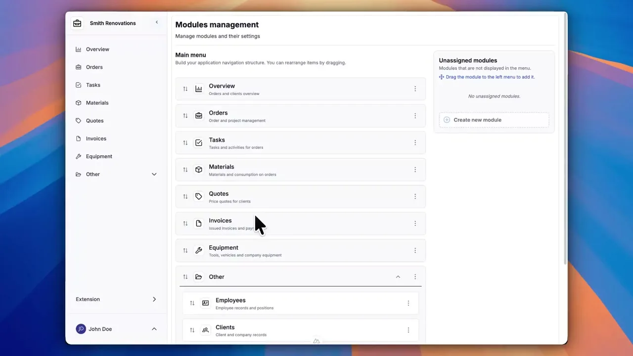
Dashboards in Portiny display KPIs, charts, and pivot tables directly inside your modules — no need to export data elsewhere. Build your overview panel by dragging widgets onto a grid, set the data source, and choose an aggregation function. Three widget types cover the needs of both managers and analysts: numeric KPIs for a quick snapshot, 6 chart styles for spotting trends, and pivot tables with drill-down for detailed breakdowns. Tab-level permissions ensure every role sees only the data it should.
A visual dashboard built into every module
Every module in Portiny can have its own dashboard with live data widgets. KPI numbers, charts, pivot tables — all in one place, no switching between tools. An admin assembles the layout by dragging widgets onto a grid. It takes minutes, not sprints.
Widgets can pull data from any module within the same app, not just the one where the dashboard lives. A sales manager sees revenue, order count, and open claims on a single screen without ever leaving the module.
Three visualization types for different roles
KPI widgets
A single bold number — sum, average, count, or max. A warehouse lead sees total stock value at a glance. An HR manager tracks open headcount.
Charts
Bar, line, pie, area, stacked bar, and donut. Configure rows, columns, and values just like a pivot — the chart type simply decides how the data is rendered.
Pivot tables
Cross-tabulation with subtotals, grand totals, and date grouping. Click any cell to open a drill-down dialog showing the underlying records.
Real scenarios, real time savings
Revenue and order overview
A sales director opens the Orders module and instantly sees monthly revenue, new deal count, and average order value on the dashboard. No manual spreadsheet tallying required.
Work-in-progress by department
A production manager needs to see job status broken down by cost center. A pivot table shows order counts in rows by center and columns by status — clicking a number reveals the actual orders.
Device and ticket monitoring
An IT admin displays a KPI with open ticket count from the Helpdesk module and a device-type chart from the Inventory module — cross-module data on one screen, zero exports.
Tab-level permissions
Each dashboard can have multiple tabs, and every tab carries its own access rights. Managers see financial KPIs while operators view production stats — all on one dashboard, but with no risk of someone seeing data that is not theirs. You add, rename, and reorder tabs directly in edit mode.
Build your dashboard in minutes
Sign up and try the drag-and-drop dashboard with KPI widgets, charts, and pivot tables. No coding, no waiting on your IT department.
Try for freeRelated Features
Try everything yourself
After signing up, you can create a demo project — a sample construction company with 9 modules and test data. Everything you see in the videos, you can click through and try yourself.